Billboard Top 100 Shiny Dashboard
Published:
A Shiny dashboard simulating the Billboard Hot 100 music chart.
🎵 Billboard Top 100 Interactive Dashboard
Team Members: Shuoyuan Gao, Shiyuan Zhang
Technology Used: R, Shiny, ggplot2, dplyr, jsonlite, shinythemes
Data Source: Simulated Billboard Top 100 dataset (due to API access limitations)
🔗 Live Demo
👉 Click here to launch the Shiny App
💡 Project Overview
In this interactive dashboard, users can:
- Explore the ranking and chart metrics of the Billboard Top 100.
- Filter songs based on whether the artist has received an award.
- Visualize Peak Position vs. Weeks on Chart with interactive plots.
- Dive into artist-specific analysis, showing song performance summaries.
- View album covers with a slider and radio toggle interface.
This dashboard simulates the Billboard chart experience with interactivity and aesthetic design, offering users insights into chart performance in a visually engaging way.
📸 Screenshots
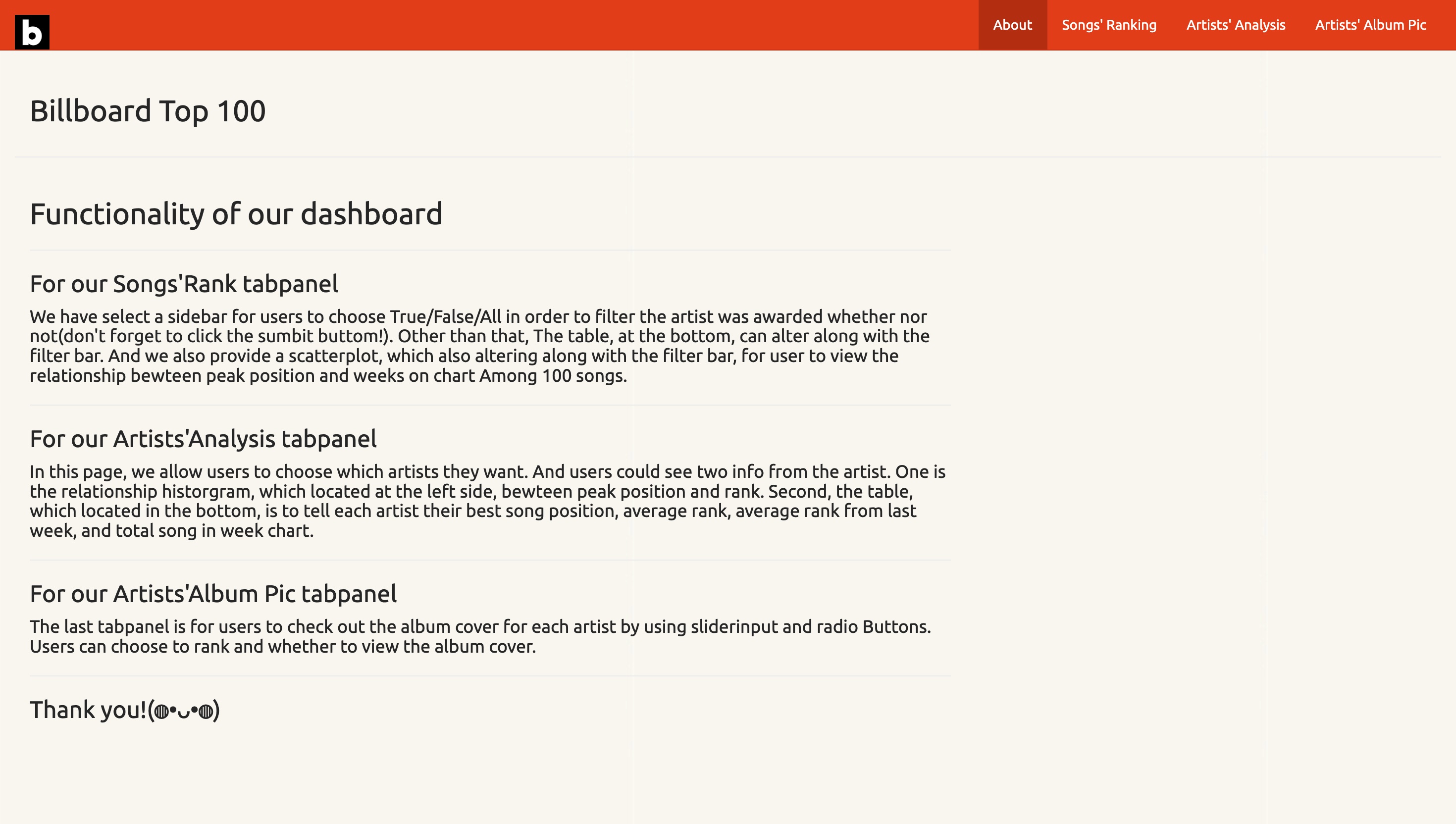 About Page
 Songs’ Ranking Scatter Plot
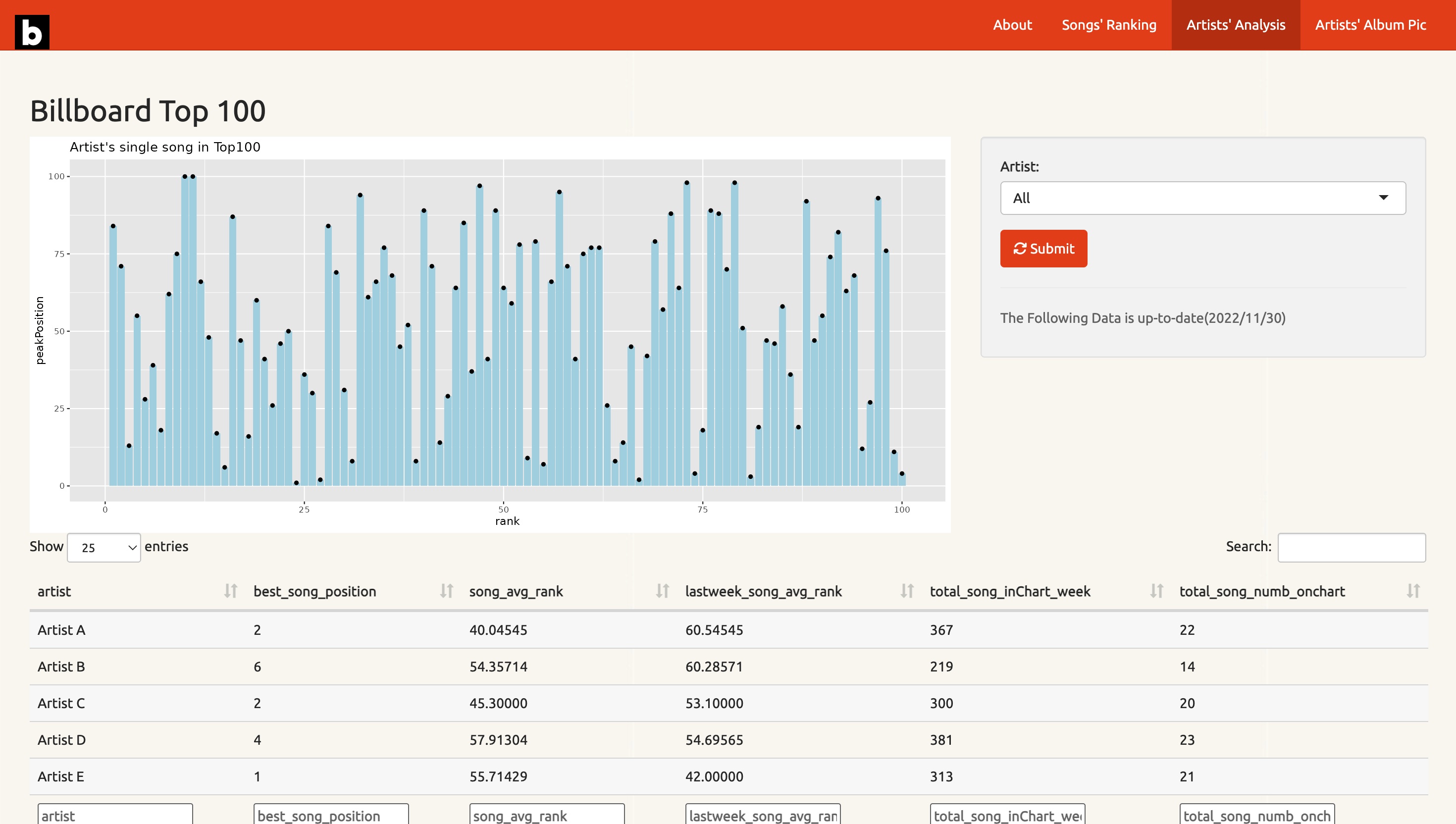 Peak Position vs. Weeks Plot
📁 Source Code
The full source code is available on GitHub.
The dataset used (Fake_Billboard_Data.csv) is included in the shiny_app/www folder for reproducibility.
📍 Technologies & Features
fluidPageandnavbarPagelayoutggplot2plots with dynamic filtering- Album artwork integration via reactive UI rendering
- CSS styling and theming via
shinythemesandtags$style