Data Visualization
📊 Data Visualization Projects
This page showcases visual storytelling projects from previous Project units using R, Python, SAS, and Tableau.
🦠 COVID-19 Trends (R)
Visual analysis of global and continent-level COVID-19 cases and deaths using public datasets.
Tools: R (ggplot2, dplyr), Tableau, and Python.
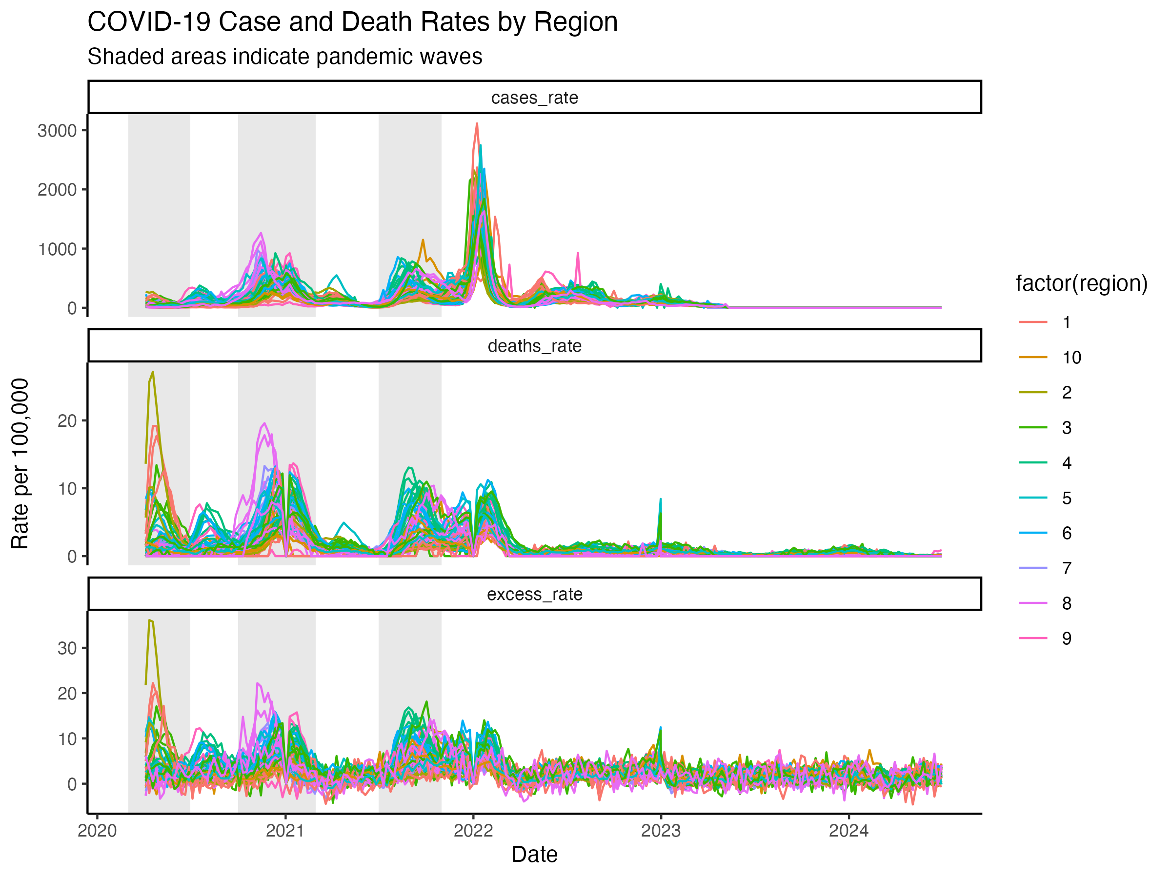
Pandemic across U.S. regions with wave intervals
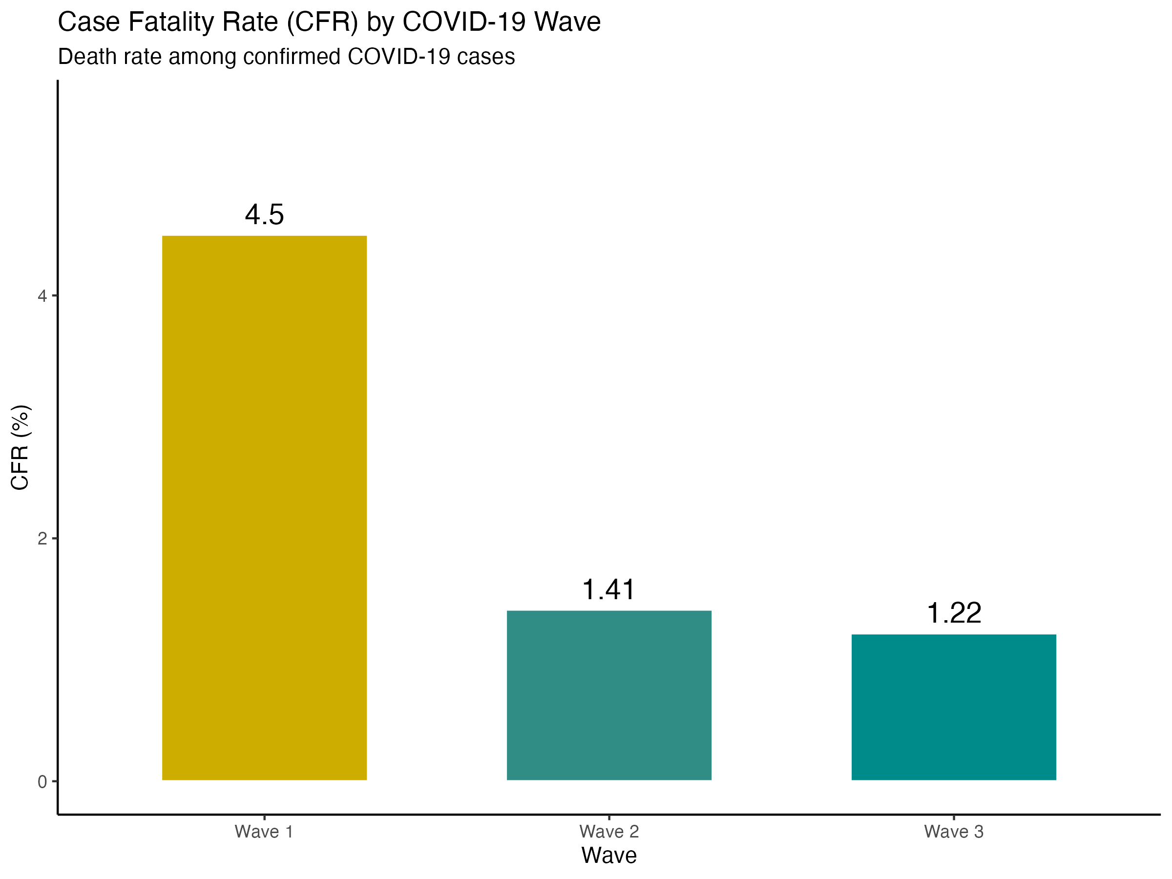
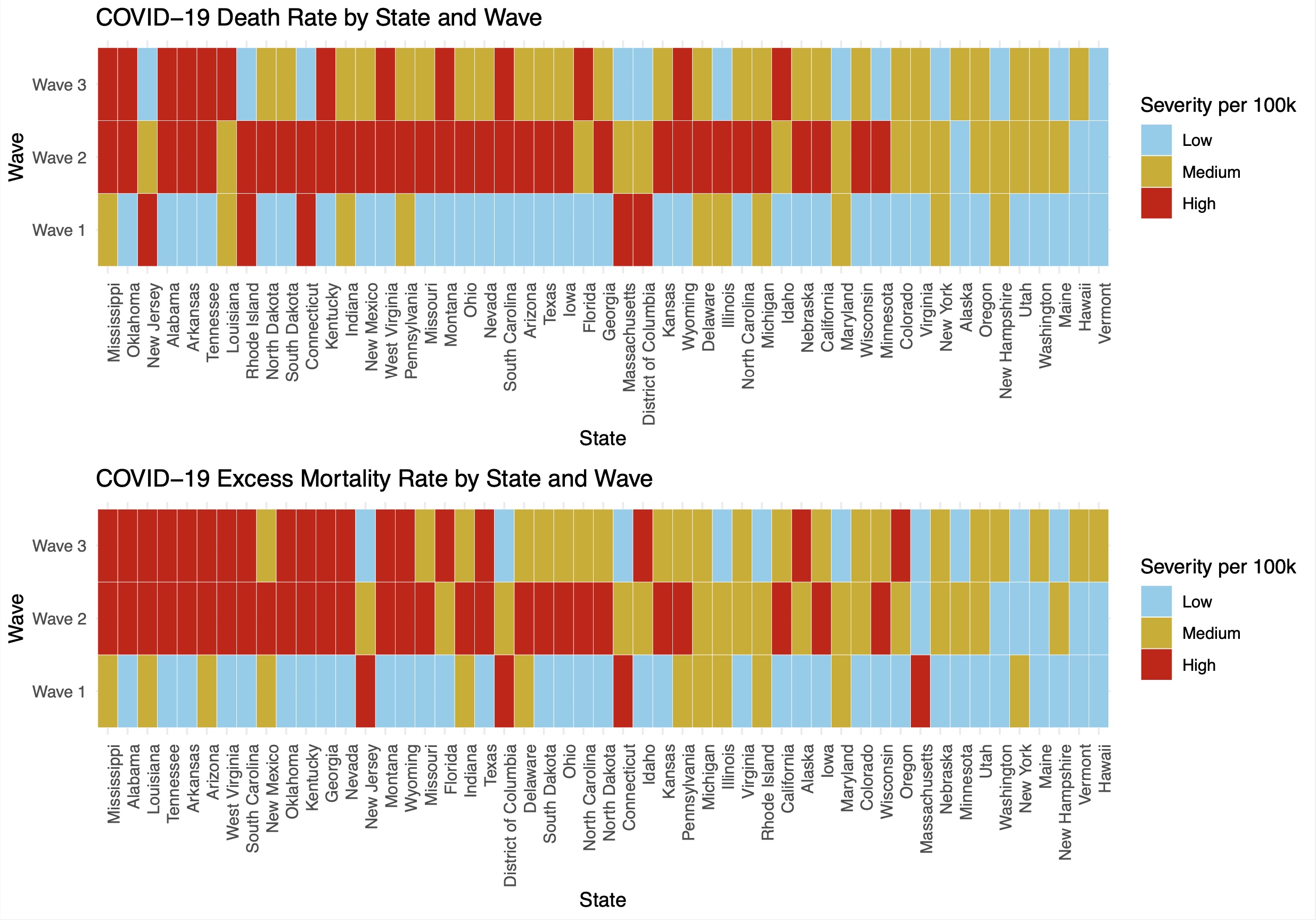
CFR By Wave
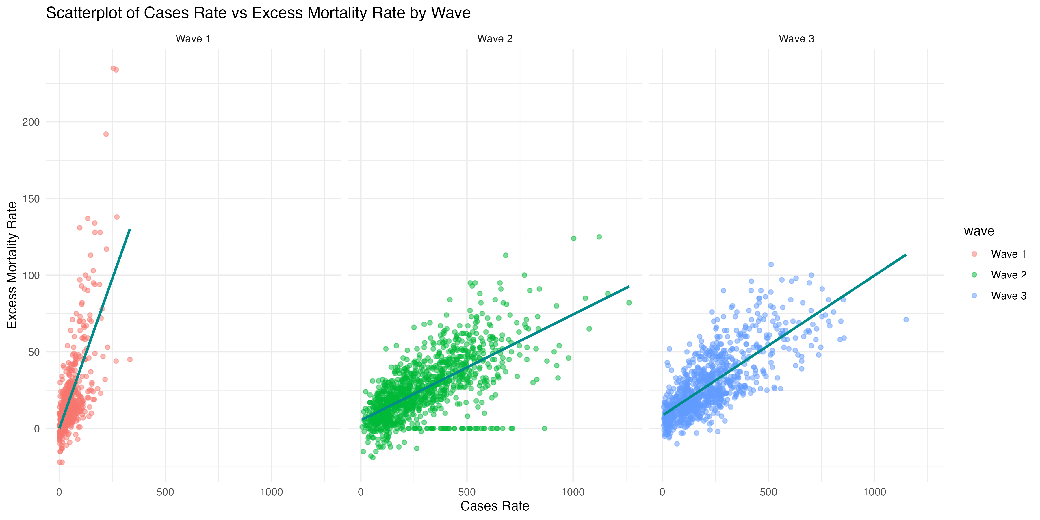
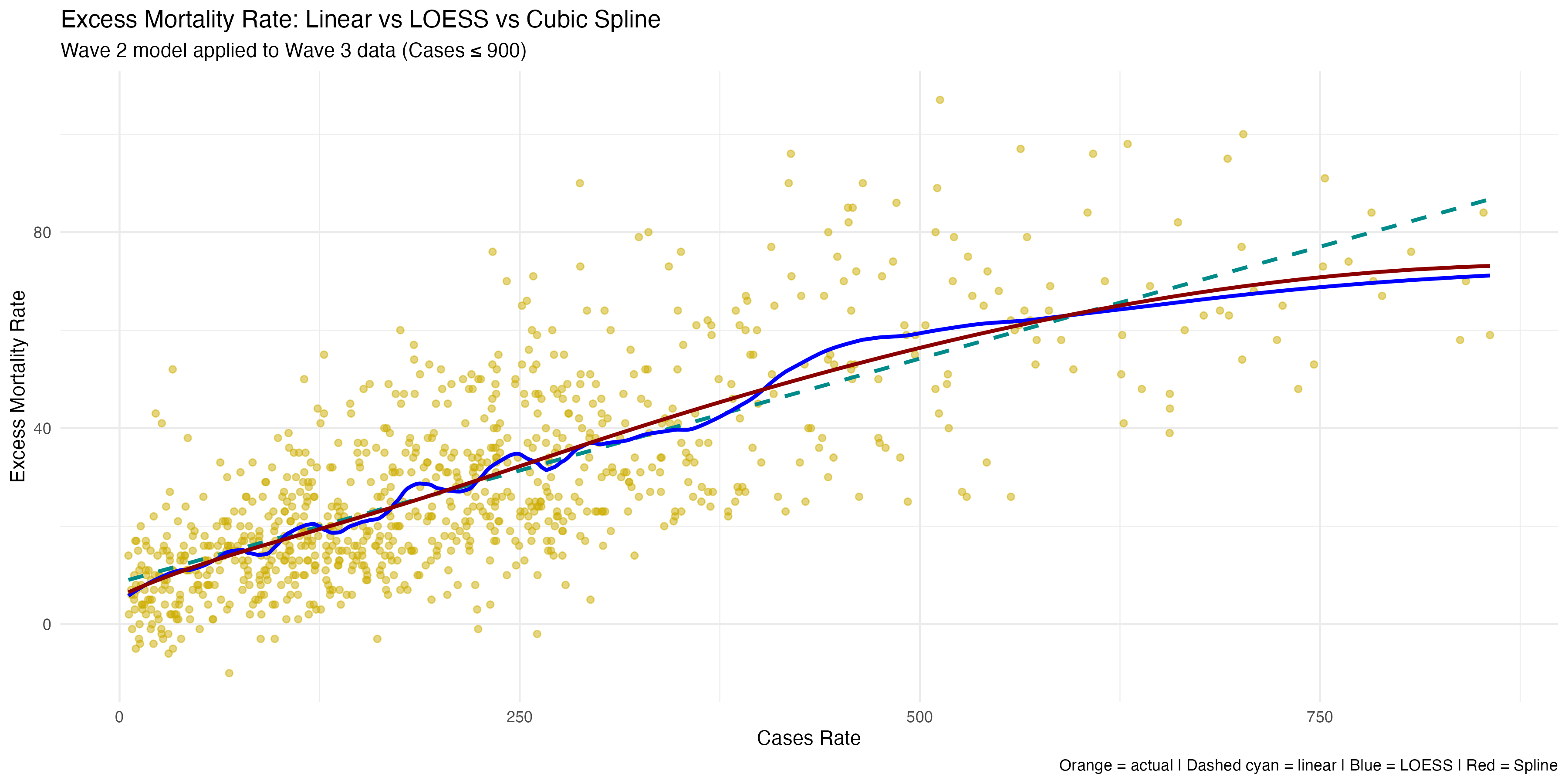
Wave-wise Excess Mortality vs. Case Rate
Heatmaps displaying wave-specific death rate classifications across states
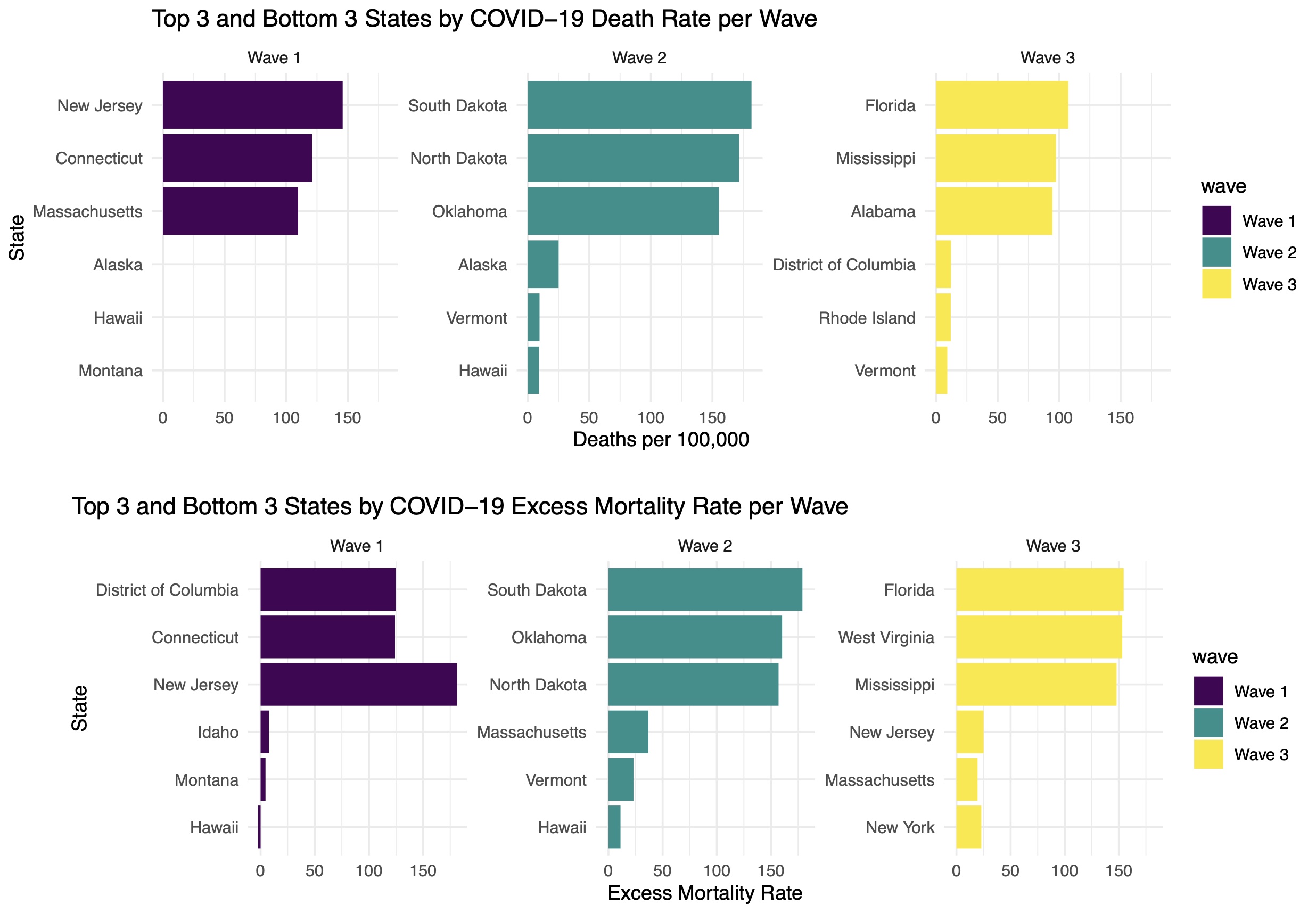
Bar plots highlighting the top and bottom 3 states by death rate in each wave
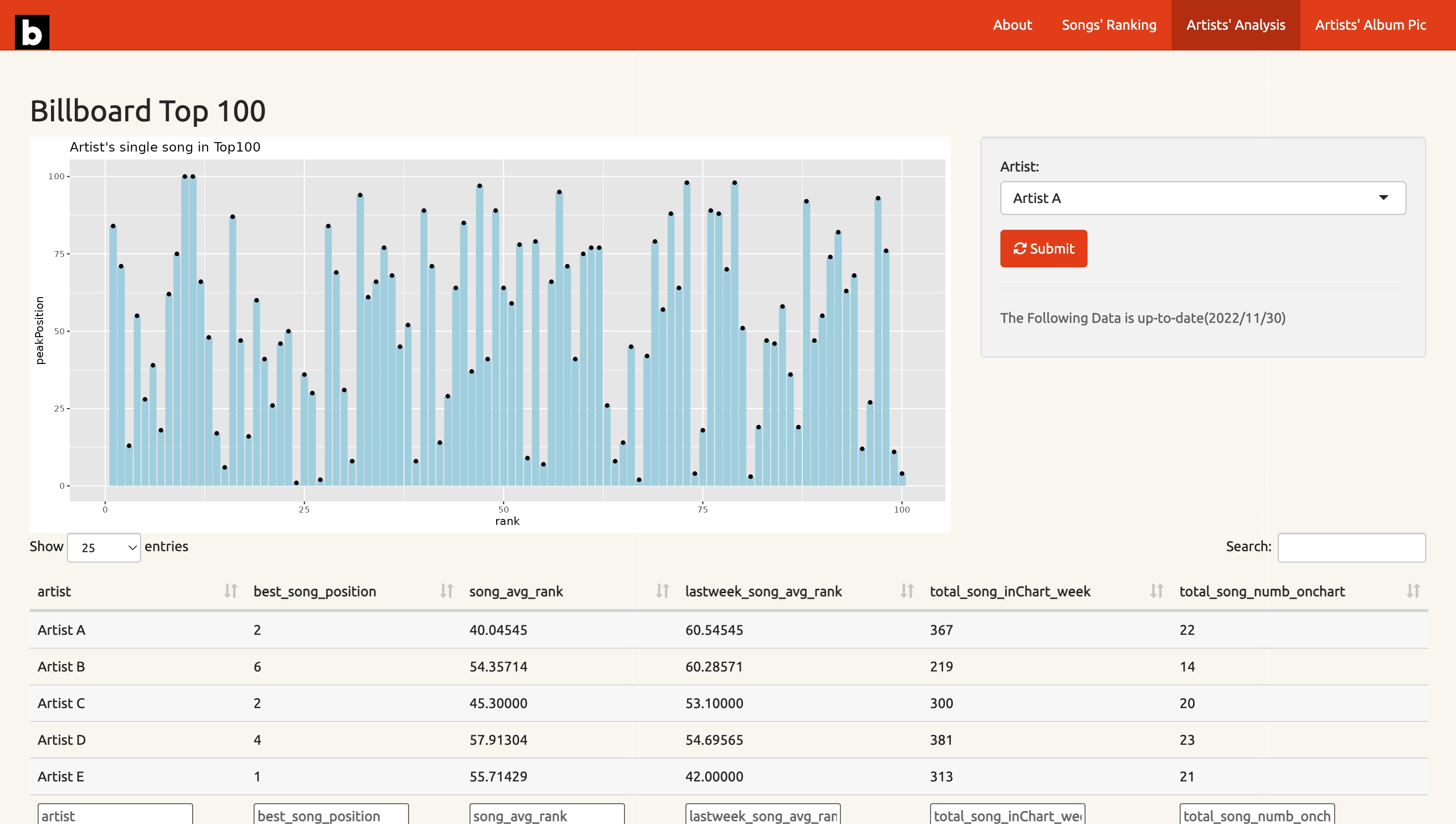
🎵 Billboard Music Trends (Shiny App)
An interactive dashboard analyzing Billboard Top 100 data, with song rankings, artist performance, and album covers.
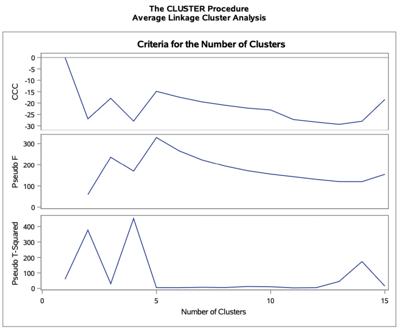
📈 Student Performance Analysis (SAS)
Summary: Used clusters and regression lines to uncover patterns in student grades, attendance, and demographic characteristics.
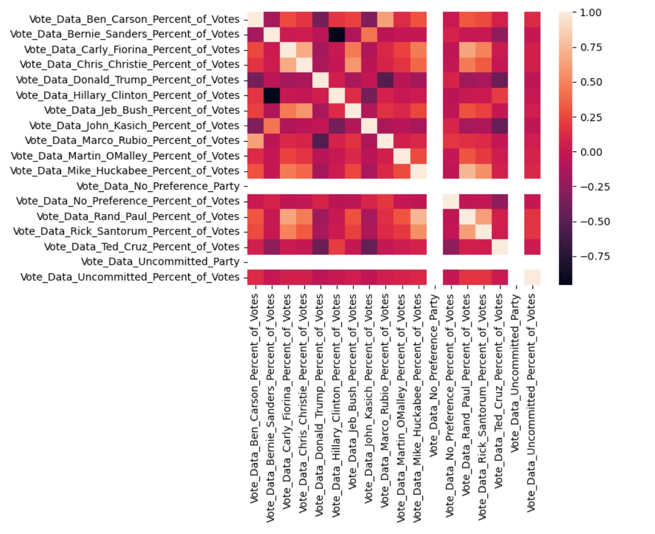
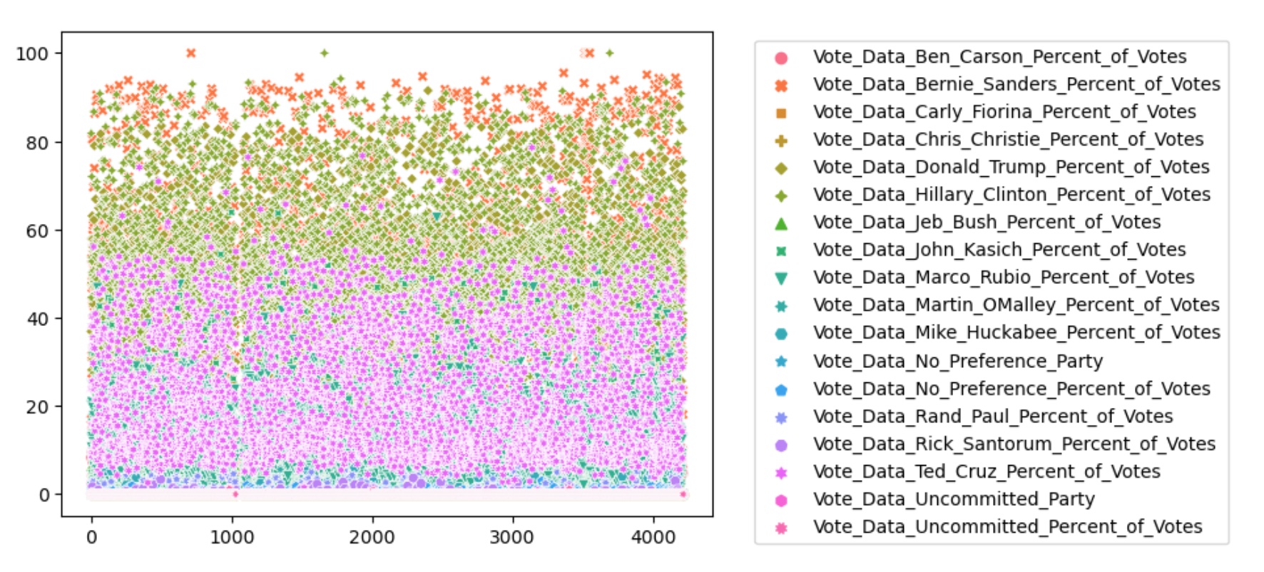
🇺🇸 U.S. Election Data Clustering (Python)
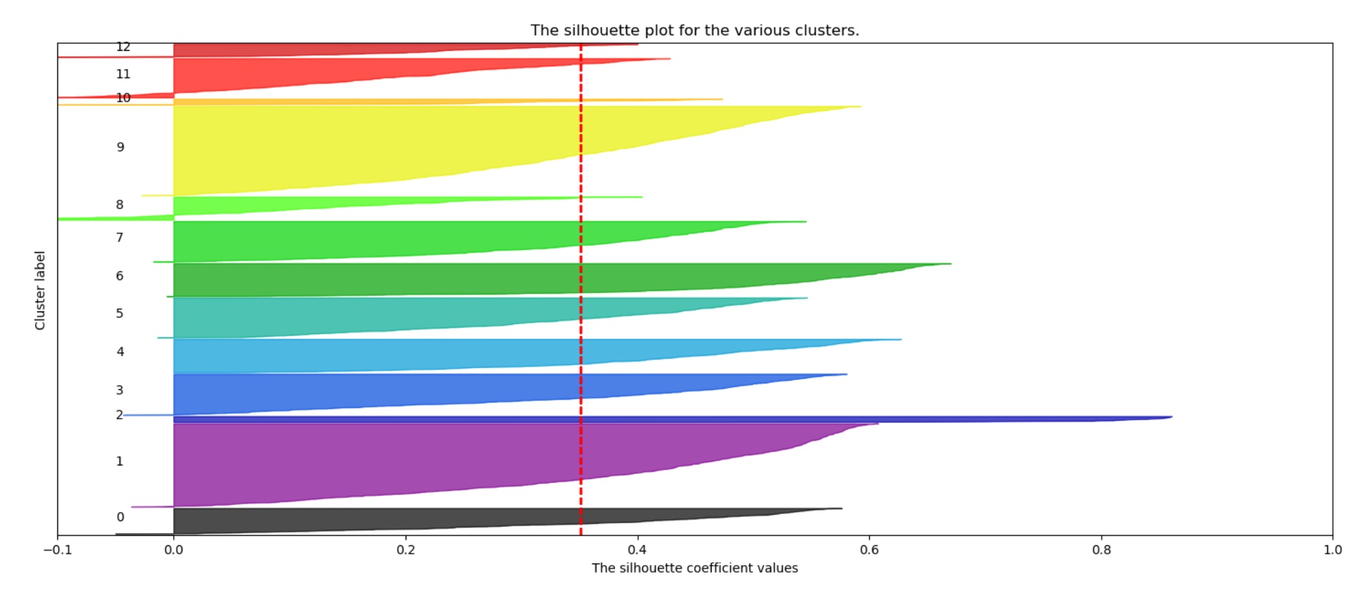
Silhouette Plot (12 Clusters)
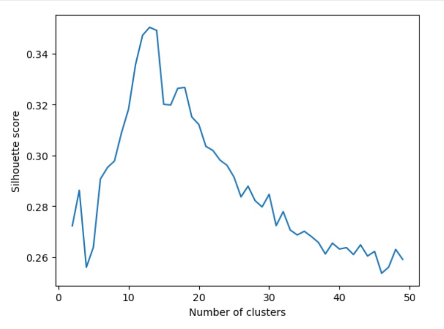
Optimal Number of Clusters – Silhouette Score
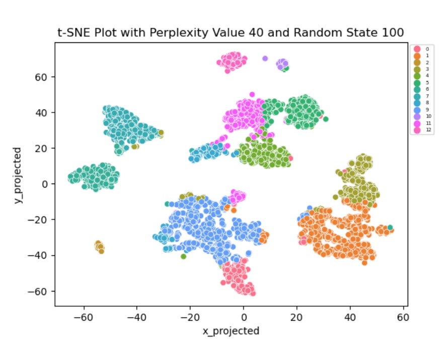
t-SNE Visualization
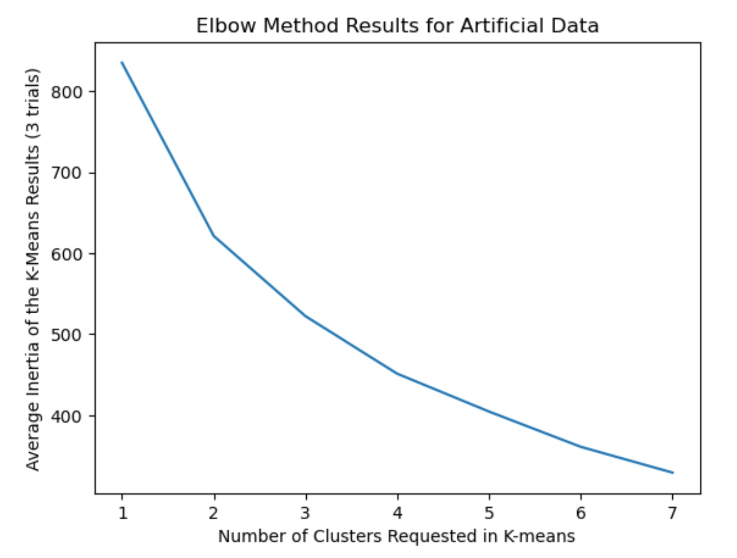
Elbow Method (Synthetic)
Candidate Vote Correlation Heatmap
Scatter Plot of Candidate Percentages
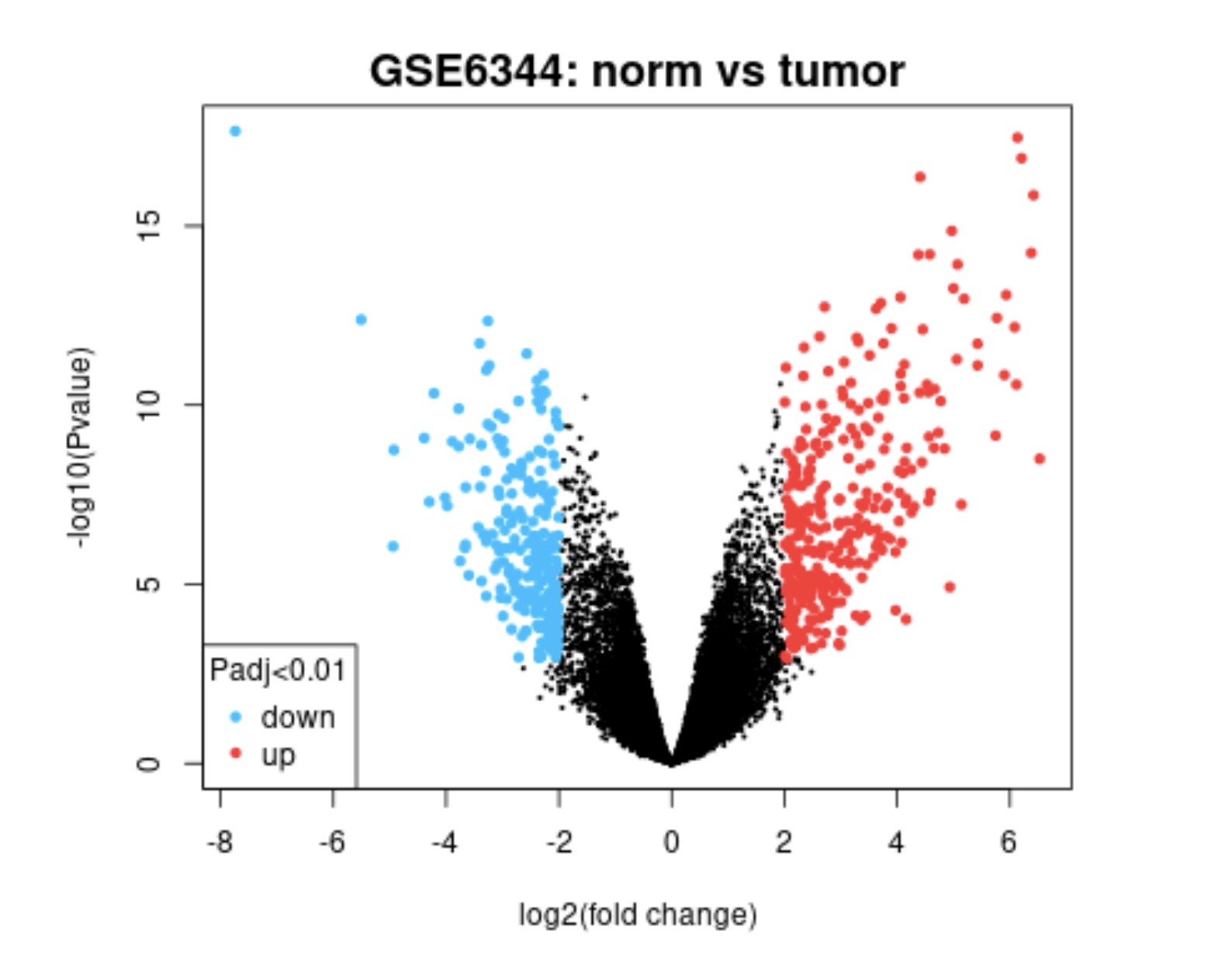
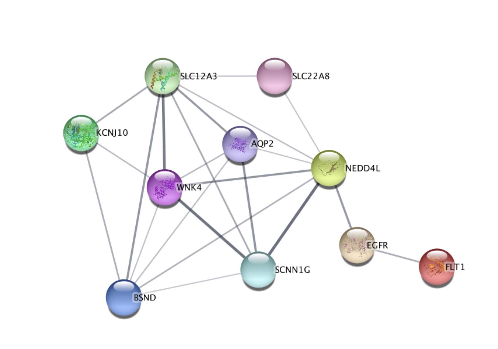
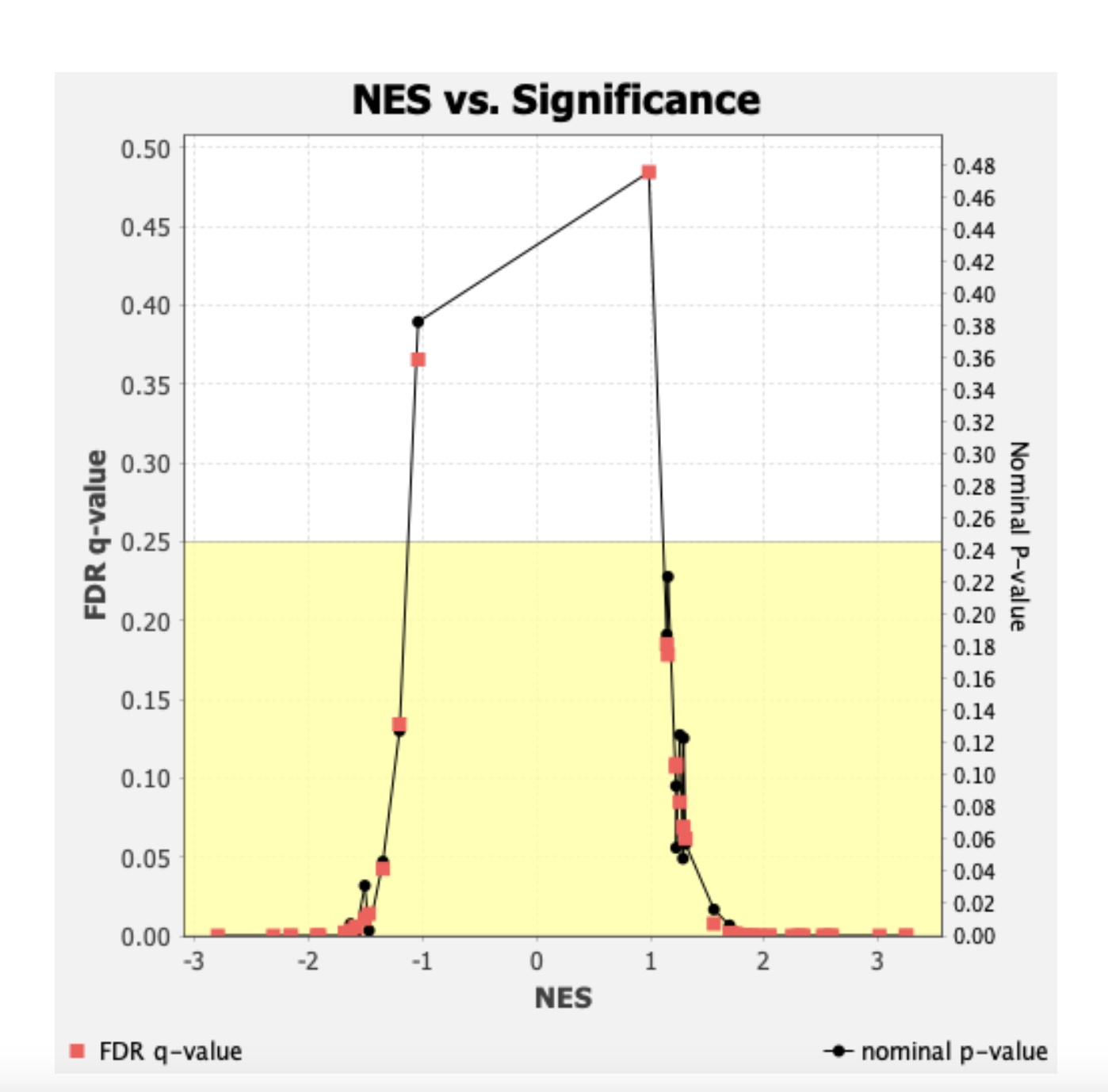
🧬 Kidney Cancer Expression Visualization
This project compares gene expression between normal and tumor kidney tissues to identify significant biological differences using volcano plots, pathway enrichment, protein interaction networks, and density comparisons.
🌋 Volcano Plot of Differential Expression
📊 Expression Density Distribution

🎯 KEGG Pathway Enrichment

🔗 Protein Interaction Network
📈 NES vs. Significance
Tools & Technologies
- R: ggplot2, shiny, dplyr, tidyr, DT, httr, jsonlite
- Python: matplotlib, seaborn, scikit-learn, pandas, numpy
- SAS: Used for clustering analysis and educational data modeling
- Tableau: Used for interactive dashboards and visual storytelling